
Case Study of Bright Eyes Family Vision Care
Dr. Nate Bonilla Warford of Bright Eyes Family Vision Care knew his website was due for a makeover. In addition to a general design update, Dr. Nate wanted to optimize his site for the search engines and incorporate his three sites into one main site (including his blog that has been active since 2007).
Dr. Nate worked very closely with our design team to create the custom website he dreamed of and this is the result: http://brighteyestampa.com
While working to create an aesthetically beautiful design, the more important goal of optimal functionality was a key consideration. To make sure Dr. Nate’s site incorporated the most current advances in design, functionality and optimization, we focused on the following key elements:
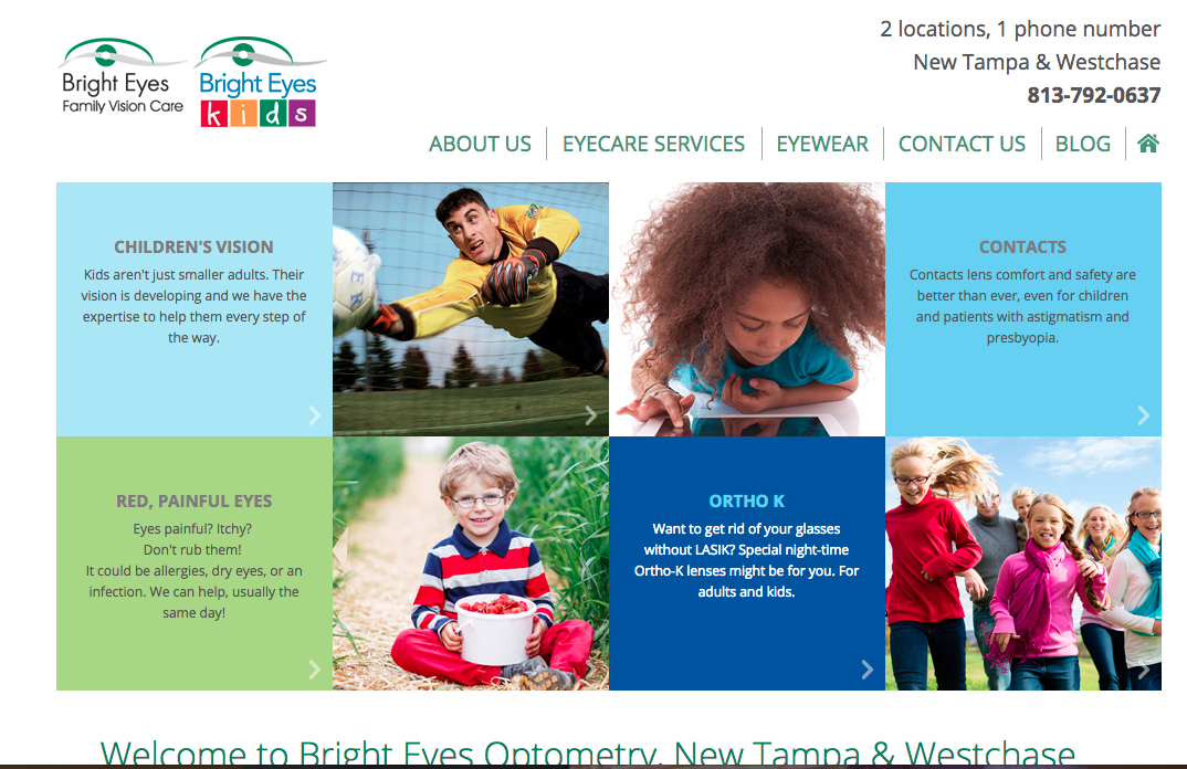
- User friendly-easy to navigate. The sight is bright and clear and users can easily and intuitively find the information they are seeking.
- Branded to create a memorable impression. The color scheme along with the graphic blocks in the site design reflect the branding in the practice logo, creating a subtle yet memorable impression on site visitors.
- User activated header. As opposed to the traditional slideshow, the header images and text turn over like building blocks. In addition to reinforcing the branding for the children’s site, the blocks are engaging for viewers and grab their attention.
- Super SEO optimized. All of the copy on the site, especially in the header area of the homepage is SEO optimized. We also included videos and redirected all of the 2000+ links from the other sites, back to this site when moving it over.
- Seamless integration of three separate sites. We amalgamated three sites into one - the main practice website, the children’s website and Dr. Nate’s blog. While wanting one cohesive website, Dr. Nate desired to maintain a differentiation between his children’s services and his adult services. Users can see clearly that distinction and easily navigate to the subpages for the information they are seeking.
- Distinct, yet branded blog subsite. While the blog maintains a fresh and unique look and feel, it is still branded well to maintain the connection with the rest of the site.
- SEO integrity. Since, Google isn't a fan of deleting content, we asked Dr. Nate to go back through his blog content and revise any out of date information so that Google’s new algorithm would give it a good rating.
Getting a website upgrade for your practice doesn’t always mean a total makeover. Sometimes a few small changes can have a huge impact on your visibility and website functionality. While Dr. Nate opted for a complete custom website redesign, there are easier and cheaper options to give your site a refresh without a total redo.
Our talented design team has just launched a whole bunch of beautiful new built-in site design options available for all EyeCarePro clients.
Have any questions about what you can do to freshen up your website? Give us a call!
